A selection of personal projects — from spatial design and brand identity to photography direction, web design, and mark-making. Different scales. Same thinking: making values visible.
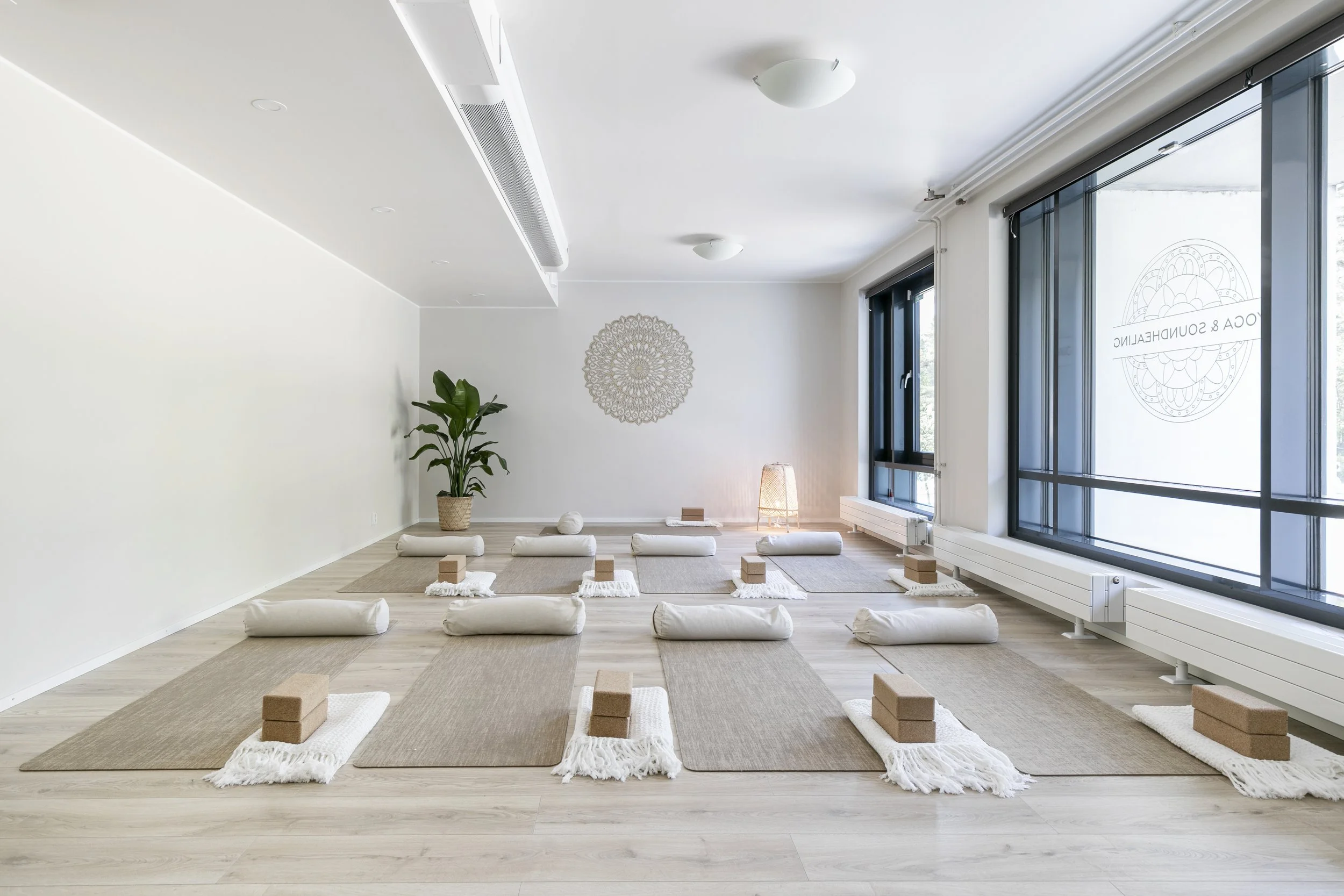
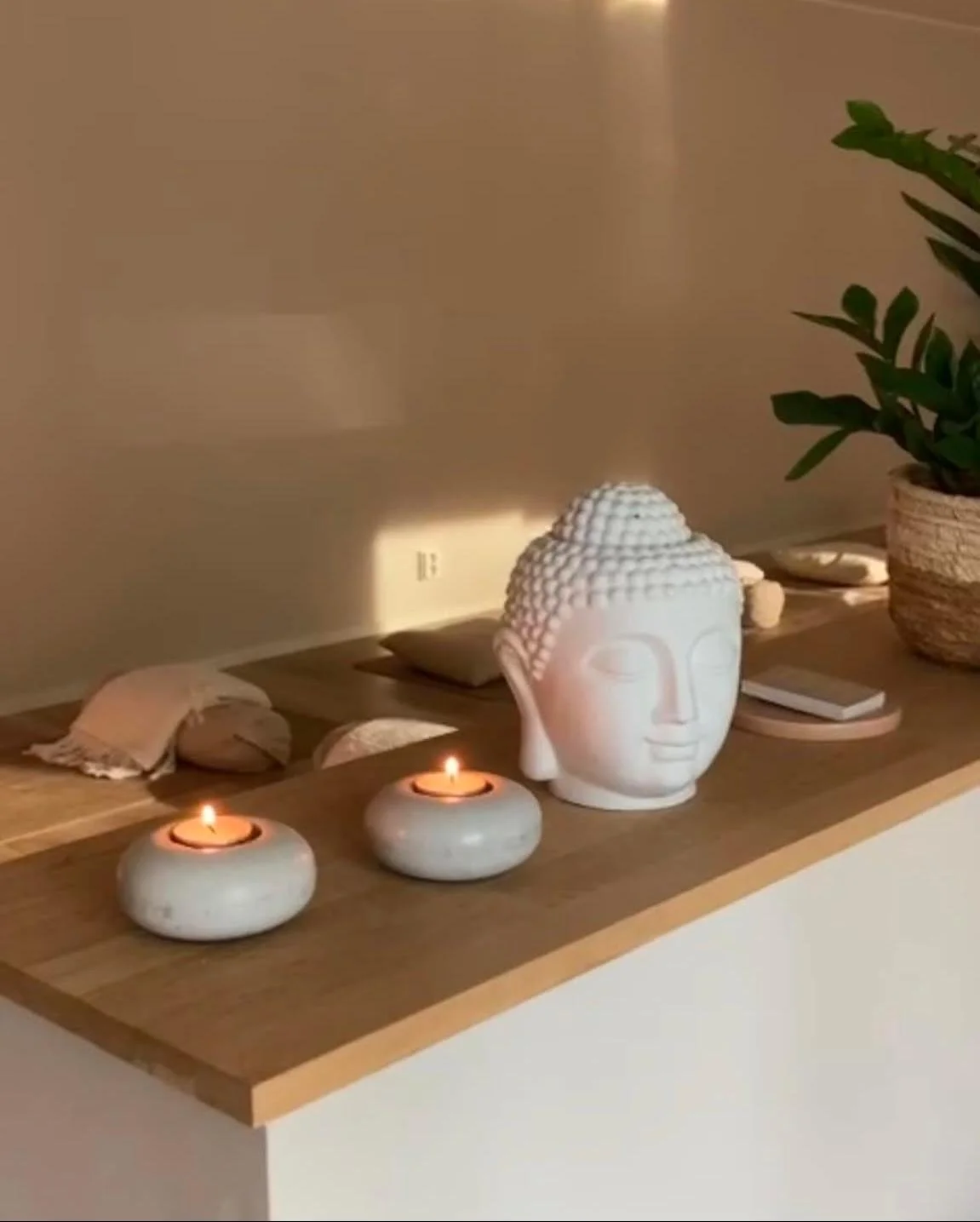
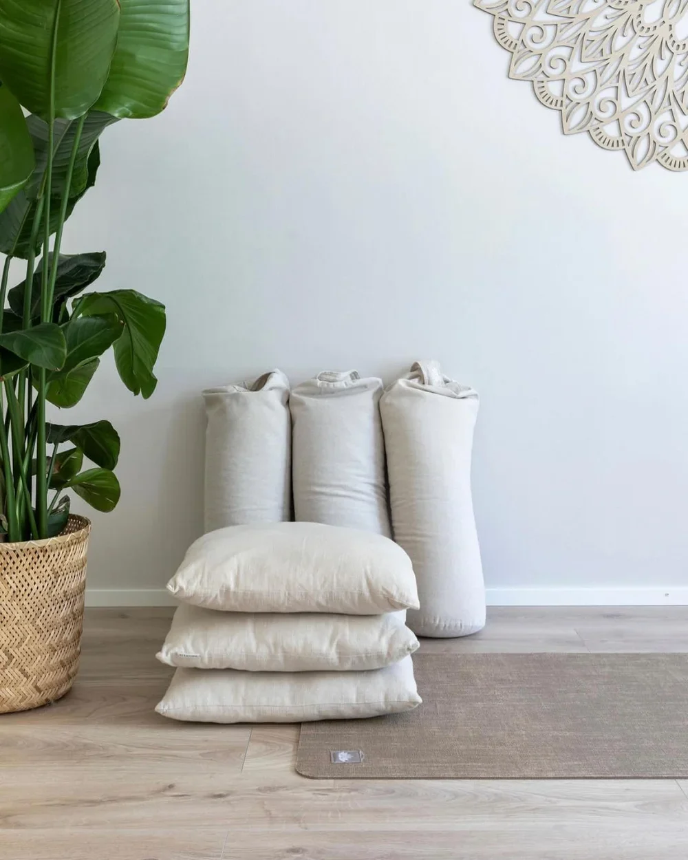
YOGA AND SOUNDHEALING STUDIO Espoo / Spatial design, brand identity & experience concept — personal project
A wellness studio designed from the inside out. Visual identity, spatial design, and the full sensory environment that were all built around one intention: a space where people come home to themselves.
Materials are neutral, calming, earthy. Every prop is natural and ecological: linen, cork, pure cotton. The branding, interior, and aesthetic speak the same language.
Color, form, light, space. Values made tangible.
Studio closing at the end of 2026.
Brand identity and visual storytelling

Suomen Kiertovoima (KIVO) Circular Economy Initiative / visual identity and brand photography / Personal Project
Logo, color palette, typography, and a photography concept built on intentional casting and production.
Every image tells the same story: circular thinking is about people, joy, and shared responsibility. Optimism, action, and human connection. Not abstract sustainability messaging.
Because how you photograph change is part of how you make people believe in it.

Web Design and Art Direction
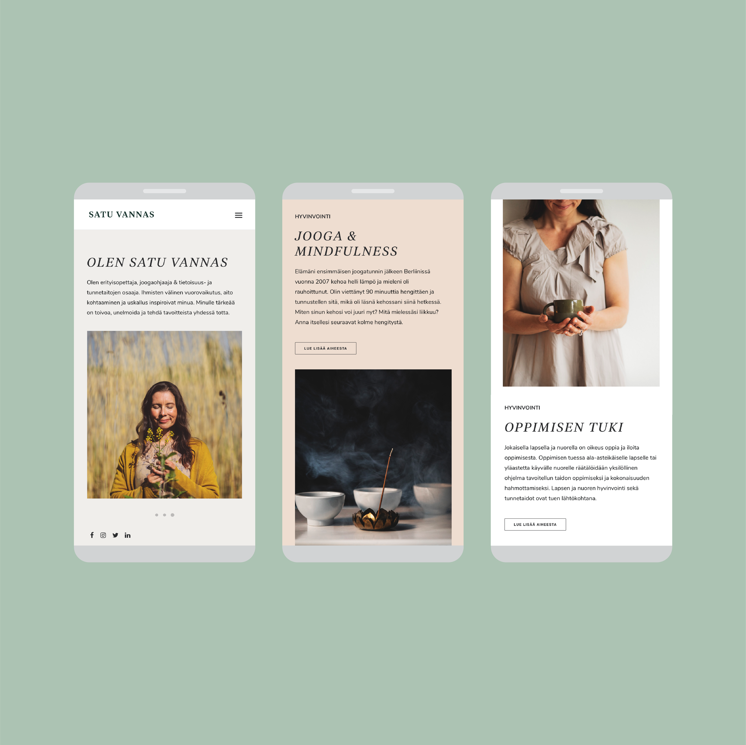
Satu Vannas Web design & art Direction / Personal Wellness Brand
Complete web presence for an educator who works in two worlds: yoga and mindfulness teaching, and special education learning support. Different rooms, same intention of helping people find what's already there.
Visual language, photography concept, layout, and typography. Every element reflects her approach: warm, intentional, human-centered.
The website becomes an extension of her teaching. Calm. Accessible. Authentic.
Not about looking perfect. About feeling true.
Strategic Elegance in a mark
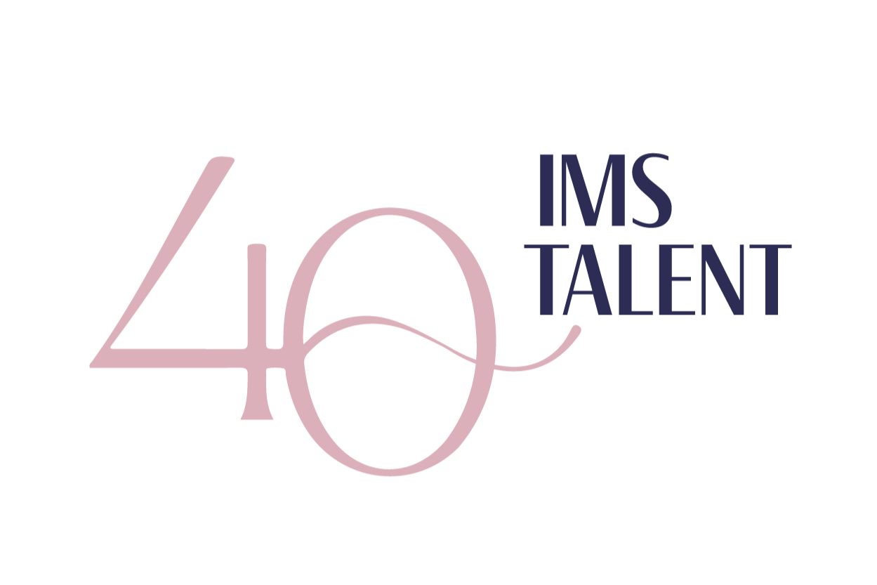
MARK-MAKING & IDENTITY IMS Talent 40-Year Anniversary Logo / PERSONAL PROJECT
For an executive search firm, I designed a mark that celebrates four decades of presence. The geometric elegance of the "40" integrated with the company name: refined, understated, memorable. This work is about restraint. One mark that conveys sophistication, longevity, and trust across multiple applications and colorways. The logo works as hard as the firm does.